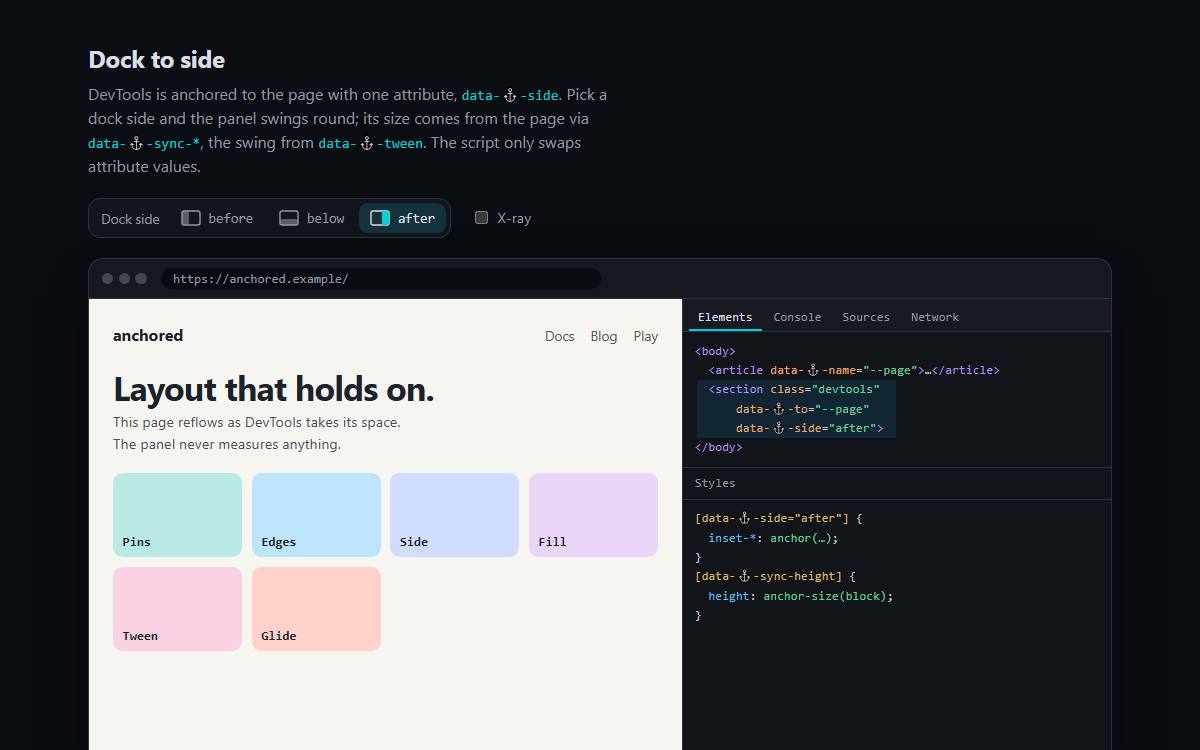
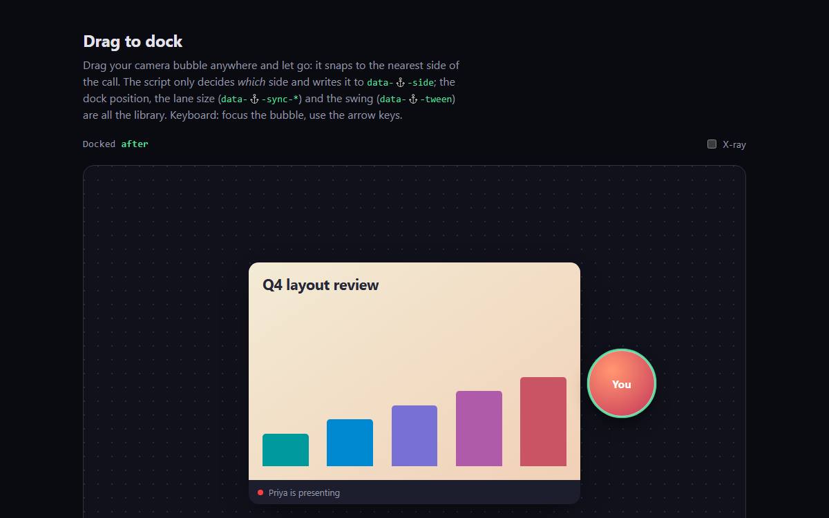
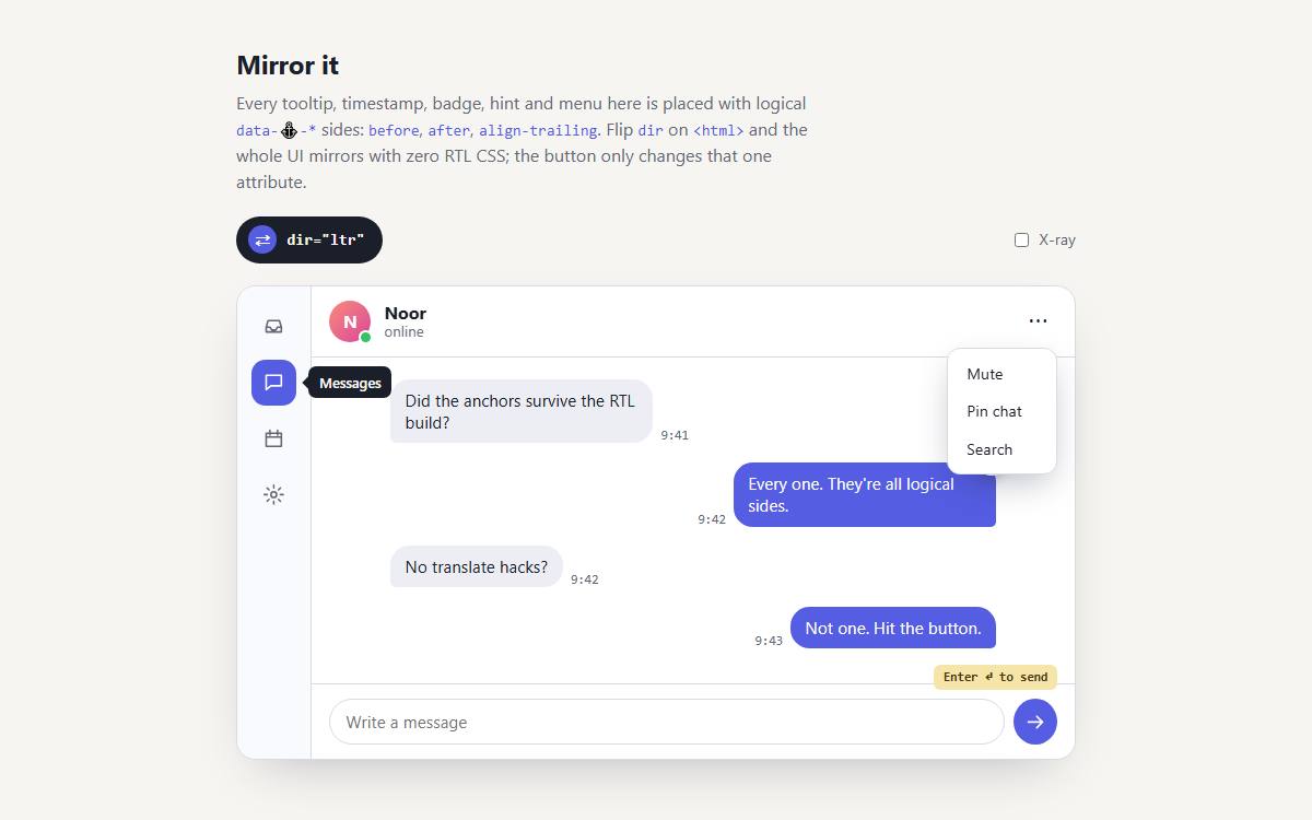
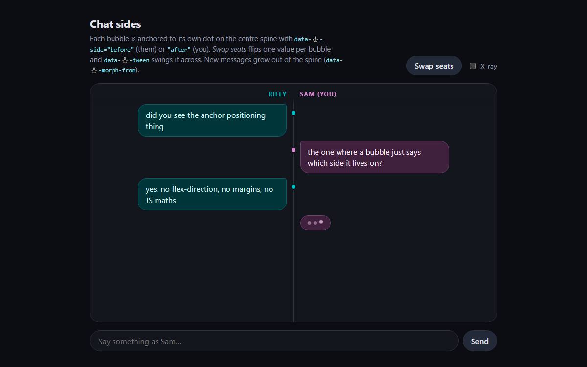
Needs typed attr(): Chrome and Edge 133+. Not in stable Safari yet; Firefox unverified. Built and verified in Chromium. Browser support
How to use it
One attribute at a time.
Each step adds one attribute to the markup. The stage beside it runs the real library on that markup. Start from a page you already have, or from nothing.
Existing project Adopt it in an existing project: a share menu that a script used to place.
NotesShare
Copy link
Email
Embed
place-menu.js
Just added
Before
A menu placed by script
A button, a menu with position: absolute, and a script that measures the button and writes top and left. It runs on load and on resize; anything else that moves the button leaves the menu behind.
index.html
<button class="share">Share</button><!-- … the rest of the page … --><menu class="share-menu">…</menu>
place-menu.js
function placeMenu() { const r = button.getBoundingClientRect(); menu.style.top = `${r.bottom + scrollY}px`; menu.style.left = `${r.right - menu.offsetWidth + scrollX}px`;}placeMenu();addEventListener("resize", placeMenu);
Step 0
Add the stylesheet
Install it and import it once. Nothing on the page moves: the library only acts on data-⚓️-* attributes.
app.css
/* npm i anchored-auto-layout */@import "anchored-auto-layout";
Step 1
Name the button
data-⚓️-name makes it an anchor called --share. Names start with two dashes.
<button class="share" data-⚓️-name="--share">Share</button><!-- … the rest of the page … --><menu class="share-menu">…</menu>
Step 2
Point the menu at it, delete the script
data-⚓️-to ties the menu to --share and takes it out of flow. With no edge set yet it stays where it would sit in flow, at the end of the page. The script can go.
<button class="share" data-⚓️-name="--share">Share</button><!-- … the rest of the page … --><menu class="share-menu" data-⚓️-to="--share">…</menu>
place-menu.js: delete
function placeMenu() { const r = button.getBoundingClientRect(); menu.style.top = `${r.bottom + scrollY}px`; menu.style.left = `${r.right - menu.offsetWidth + scrollX}px`;}placeMenu();addEventListener("resize", placeMenu);
Step 3
Hang it below
data-⚓️-below puts the menu's top edge on the button's bottom edge. No value needed: it reads --share from data-⚓️-to.
<button class="share" data-⚓️-name="--share">Share</button><!-- … the rest of the page … --><menu class="share-menu" data-⚓️-to="--share" data-⚓️-below>…</menu>
Step 4
Line up the trailing edges
data-⚓️-align-trailing matches the right edges, or the left ones in RTL. Back where the script put it, without the script.
<button class="share" data-⚓️-name="--share">Share</button><!-- … the rest of the page … --><menu class="share-menu" data-⚓️-to="--share" data-⚓️-below data-⚓️-align-trailing>…</menu>
Step 5
Flip when there's no room
data-⚓️-try="flip-y" lets the browser use the other side when the menu would overflow. Move the toolbar to the bottom and the menu opens above the button.
<button class="share" data-⚓️-name="--share">Share</button><!-- … the rest of the page … --><menu class="share-menu" data-⚓️-to="--share" data-⚓️-below data-⚓️-align-trailing data-⚓️-try="flip-y">…</menu>
From scratch Lay out from scratch: a sidebar, a main column and a loading cover.
nav
main
Loading…
Just added
Step 0
Add the stylesheet
Install it and import it once. Nothing on the page moves: the library only acts on data-⚓️-* attributes.
app.css
/* npm i anchored-auto-layout */@import "anchored-auto-layout";
Step 1
Name the one block that stays in flow
Start with plain blocks in source order. main stays in flow and becomes the anchor --main; the rest hang off it.
data-⚓️-before="--main" puts the nav's trailing edge on main's leading edge. There's no data-⚓️-to here, so the anchor goes in the value. Main keeps a margin for it in your own CSS.
No. The library is one CSS file and the attributes are read by CSS. The demos on this site use a few lines of script for input, such as dragging the anchor; none of it does layout.
Which browsers does it work in?
It needs typed attr(), so Chrome and Edge 133 and up. Safari doesn't ship it yet and Firefox is unverified. Where it's missing, the page falls back to plain flow.
Does it work with popovers?
Yes. The Menu on this site is a native popover anchored to its button with data-⚓️-to and data-⚓️-below, and it morphs out of it.
Where are all the attributes?
The Reference lists every attribute with a live stage. The Spec is the long form, and llms.txt is the same material for your assistant.
How big is it?
19.9 KB of CSS, MIT licensed, with nothing else to install.
@import "anchored-auto-layout";
Stop writing JavaScript to put one box next to another.